BACKCOUNTRY.COM PRODUCT GUIDES
UX Design • September 2016
BACKGROUND
Backcountry.com is a is an online specialty retailer that has been selling outdoor gear and clothing since 1996. Backcountry is known for the exemplary customer service provided by their "Gearheads"-- product experts who are employed to support customers and ensure that they're well-informed about getting the right gear for their outdoor adventures.
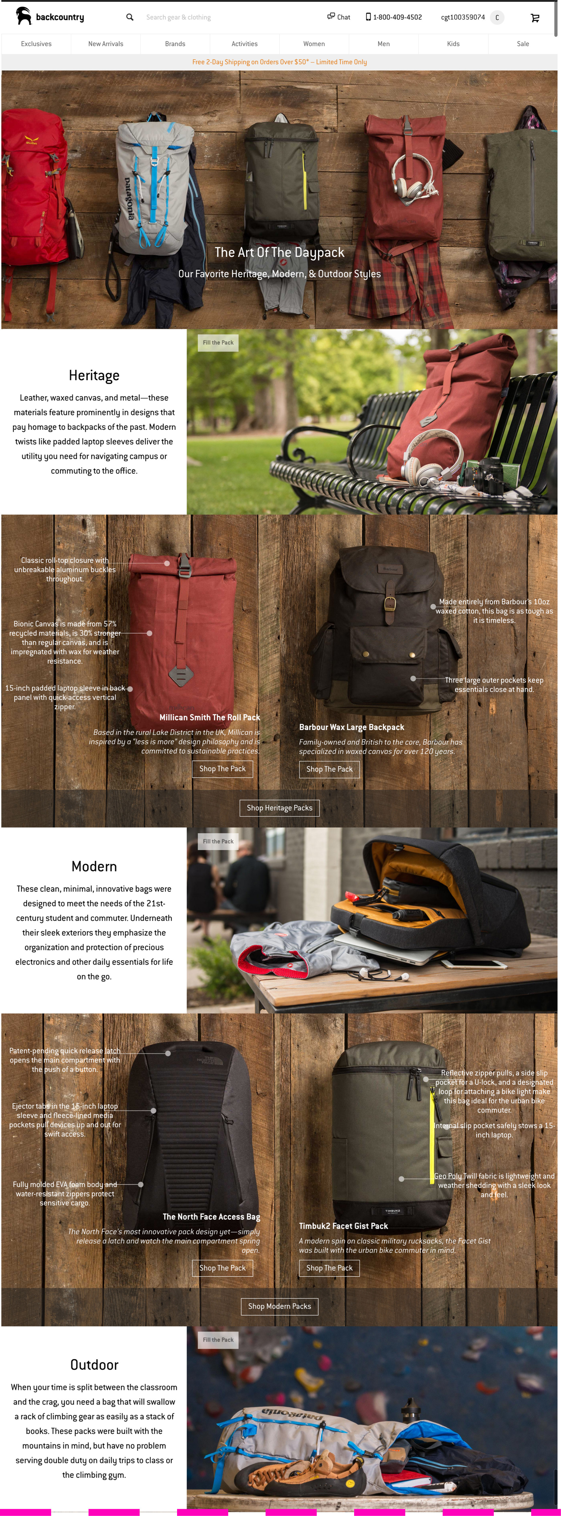
Backcountry's Product Guides (pictured below) help give potential buyers some guidance when performing research into something new or unfamiliar to them.
DESIGN CHALLENGE
While Product Guides provide some marginal value to customers, Backcountry wanted to revisit the Product Guides initiative. The Guides were relatively expensive to put together from an internal resourcing perspective, as they required a good amount of human time to identify and compile the information and details worth sharing about certain products.
Business Goals
Strengthen Backcountry’s voice within the outdoor space
Deliver increased value and insight on specific products
Distinguish from competitors
Spend less, and sell more
user Goals
Learn enough about products to make a sound purchase decision
Note: The majority of Backcountry’s customers arrive to the site via newsletters, and mostly from mobile devices— 55% of traffic from mobile, another 10% from tablets.
My Role
For this project, I worked solo, and conducted all research and design activities over the course of about 1.5 weeks.
Start with Who
Many Backcountry customers do not consider themselves “experts,” and often come to Backcountry.com to do research before trying out a new activity-- a good number of their customers are female and generally in a younger demographic.
For this project, I wasn't able to conduct first-person research, so I started by creating a proto persona, and documenting all the informed assumptions I could make about the target audience.
My creative process typically begins on pen and paper-- what you see below are my notes on Miriam, our proto persona and target customer (right), and a higher-fidelity version (left).
Evaluating the Current State
The next step in my design process was to understand what was working well in the current state of design, and what could be improved upon. In addition to evaluating the quantitative facts (like views, clickthrough and conversion rates), it was important to layer in some of the "why" behind poor conversion.
Setting the Stage
Backcountry's Product Guides are useful. They provide information that customers seek. And they're also usable-- there aren't any huge usability or accessibility issues with these pages; however, the experience is not very "sticky." It's not special enough to keep people coming back for more.
I started thinking about what could make this experience more desirable. Desirability is important. We're living in an experience economy-- consumers unquestionably desire experiences, and more and more businesses are responding by explicitly designing and promoting them (think about Snapchat and Instagram).
As mentioned, Backcountry is known for the unique, bespoke service and sense of community provided by their Gearheads, who are always online and ready to chat with customers. It would be ideal if a customer's interactions with Product Guides-- which are static pages of text and images-- could have the same level of warmth that one might feel when talking to a Gearhead.
Design principles
As is typical with my design process, it was now time for me to lay down the foundation for the new experience, which I like to do with design principles (or "tenets" as we would call them at Amazon).
Looking forward to crafting a new experience, Product Guides should be:
Informative • Visual • Interactive • Personal
Existing Product Guides were already informative and visual, but somewhat lacking in the latter two areas of interactivity and feeling personal.
Design Begins
I wanted to lean into the areas of interactivity and personality by bringing in more social and Gearhead integration, and adding in a quiz component to boost engagement and tailored recommendations.
Why a quiz? Because we're humans, and we just can't resist...
"Quizzes are an effective way to play on people’s inherent self-interest and desire to define themselves. This is a major reason you’re seeing them all over your social networks. They are rarely founded upon anything scientific, but they are a fun and easy way to get just a little more insight to someone’s personality... Given the undeniable popularity of quizzes, they should be a key part of any company’s content strategy. People love taking them and sharing them with their friends..." - Marketo
I sought out to do a little competitive research and look around for inspiration, and then started sketching. Once I solidified some ideas on paper, I moved them up a level of fidelity and started wireframing and adding in colors, textures, typography, and images and getting into visual design.
COMPETITors, VISUAL INSPIRATION, Early Sketches & Wires


As you can see in my wireframes, I was playing around with the unique shape of the "t" in Backcountry's brand font-- Conduit. I wanted to break away from the traditional rectilinear grid layouts that you typically see in eCommerce.


Visual Design
Final Comps And customer Journey
Miriam knows she needs a sleeping bag, but little else. She uses her phone to search Google and finds a link to Backcountry's sleeping bag Product Guides.
She sees they're broken into two categories, but doesn't totally understand where to begin.
She taps on "Help Me Decide" and takes Backcountry's Sleeping Bag Quiz, and after answering a few questions, is directed to a collection of bags, with reviews from Gearheads and pictures from Instagram of people using the bag "in the wild."
Implementation
As you may recall, one of the biggest issues with the current state of Product Guides was the time and cost it required for human workers to put together a collection of like-products, write compelling product copy, design and code an attractive page for customers.
The new Product Guides ("Sleep Outside" Guide seen above) represent a templatized system, with 3-5 alternative layouts for products of different 'shapes' (think bicycles, tents or even some clothing items whose stock photos are not long rectangular shapes).
While it does require human intervention to determine which categories should have Product Guides (and to write short quizzes for each, which Gearheads are more than equipped to do), the great majority of the template content could be automated. Leveraging data from Backcountry's Product Information System, a Guide is compiled using product category IDs, and selects only items that have Gearhead reviews and Instagram tags-- product names and feature blurbs are already written for each product in Backcountry's database.


